
How to handle errors in SwaggerUI
Written onError handling is an essential aspect of today's modern Single Page Applications. Error handling refers to the anticipation, detection, and resolution of different kinds of errors. As of version v4.3.0, SwaggerUIs error handling capabilities have considerably improved and allowed SwaggerUI integrators to easily integrate their custom errors handlers.
Original SwaggerUI error handling consisted of wrapping every render method of every class component
with an imperative try/catch statement and displaying the Fallback component if the error was thrown.
Along with displaying the Fallback component, console.error was used to display the caught error in the browser console.
This solution required wrapping every function component into class component to make sure that
the component has the render method.
React 16 introduces a new concept of an error boundary. It’s no longer necessary to create a custom solution for catching errors in React apps, as we have a standardized way of doing it.
In order to fully utilize new error boundaries, I had to rewrite SwaggerUIs view plugin, which all other
plugins build on. An additional new plugin called safe-render was introduced to allow configurable
application of error boundaries to SwaggerUI components.
View plugin
View plugins public API didn’t change, I’ve just added one additional util function called getDisplayName
which is used for accessing React component names.
1
2
3
4
5
6
7
8
9
10
{
  rootInjects: {
    getComponent: memGetComponent,
    makeMappedContainer: memMakeMappedContainer,
    render: render(getSystem, getStore, getComponent, getComponents),
  },
  fn: {
    getDisplayName,
  },
}
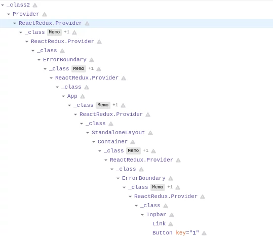
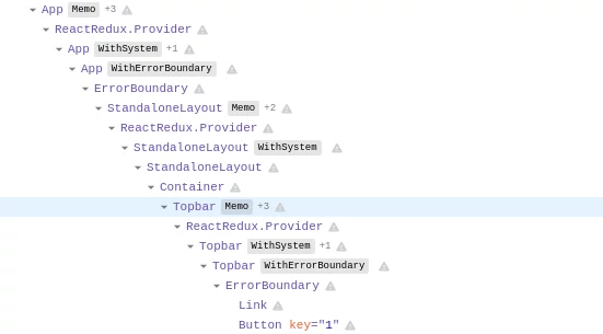
view plugin is no longer responsible for error handling logic. Rewriting the plugin had several
positive side effects like making the SwaggerUI rendering faster and simplifying the React component
tree in React developer tools:
Safe-render plugin
This plugin is solely responsible for error handling logic in SwaggerUI. Accepts a list of component names that should be protected by error boundaries.
Its public API looks like this:
1
2
3
4
5
6
7
8
9
10
{
  fn: {
    componentDidCatch,
    withErrorBoundary: withErrorBoundary(getSystem),
  },
  components: {
    ErrorBoundary,
    Fallback,
  },
}
safe-render plugin is automatically utilized by base and standalone SwaggerUI presets and should always be used as the last plugin, after all the components are already known to the SwaggerUI. The plugin defines a default list of components that should be protected by error boundaries:
[
  "App",
  "BaseLayout",
  "VersionPragmaFilter",
  "InfoContainer",
  "ServersContainer",
  "SchemesContainer",
  "AuthorizeBtnContainer",
  "FilterContainer",
  "Operations",
  "OperationContainer",
  "parameters",
  "responses",
  "OperationServers",
  "Models",
  "ModelWrapper",
  "Topbar",
  "StandaloneLayout",
  "onlineValidatorBadge"
]
As demonstrated below, additional components can be protected by utilizing the safe-render plugin with configuration options. This gets really handy if you are a SwaggerUI integrator and you maintain a number of plugins with additional custom components.
1
2
3
4
5
6
7
8
9
10
11
12
13
14
15
16
17
const swaggerUI = SwaggerUI({
  url: "https://petstore.swagger.io/v2/swagger.json",
  dom_id: '#swagger-ui',
  plugins: [
    () => ({
      components: {
        MyCustomComponent1: () => 'my custom component',
      },
    }),
    SwaggerUI.plugins.SafeRender({
      fullOverride: true, // only the component list defined here will apply (not the default list)
      componentList: [
        "MyCustomComponent1",
      ],
    }),
  ],
});
componentDidCatch
This static function is invoked after a component has thrown an error.
It receives two parameters:
error- The error that was thrown.info- An object with a componentStack key containing information about which component threw the error.
It has precisely the same signature as error boundaries componentDidCatch lifecycle method, except it’s a static function and not a class method.
Default implement of componentDidCatch uses console.error to display the received error:
export const componentDidCatch = console.error;To utilize your own error handling logic (e.g. bugsnag), create new SwaggerUI plugin that overrides componentDidCatch:
1
2
3
4
5
6
7
8
9
10
11
12
const BugsnagErrorHandlerPlugin = () => {
  // init bugsnag

  return {
    fn: {
      componentDidCatch = (error, info) => {
        Bugsnag.notify(error);
        Bugsnag.notify(info);
      },
    },
  };
};
withErrorBoundary
This function is HOC (Higher Order Component). It wraps a particular component into the ErrorBoundary component.
It can be overridden via a plugin system to control how components are wrapped by the ErrorBoundary component.
In 99.9% of situations, you won’t need to override this function, but if you do, please read the source code of this function first.
Fallback
The component is displayed when the error boundary catches an error. It can be overridden via a plugin system. Its default implementation is trivial:
1
2
3
4
5
6
7
8
9
10
11
12
import React from "react"
import PropTypes from "prop-types"

const Fallback = ({ name }) => (
  <div className="fallback">
    😱 <i>Could not render { name === "t" ? "this component" : name }, see the console.</i>
  </div>
)
Fallback.propTypes = {
  name: PropTypes.string.isRequired,
}
export default Fallback
Feel free to override it to match your look & feel:
1
2
3
4
5
6
7
8
9
10
11
12
13
const CustomFallbackPlugin = () => ({
  components: {
    Fallback: ({ name } ) => `This is my custom fallback. ${name} failed to render`,
  },
});

const swaggerUI = SwaggerUI({
  url: "https://petstore.swagger.io/v2/swagger.json",
  dom_id: '#swagger-ui',
  plugins: [
    CustomFallbackPlugin,
  ]
});
ErrorBoundary
This is the component that implements React error boundaries. Uses componentDidCatch and Fallback
under the hood. In 99.9% of situations, you won’t need to override this component, but if you do,
please read the source code of this component first.
Change in behavior
In prior releases of SwaggerUI, almost all components have been protected, and when thrown error,
Fallback component was displayed. This changes with SwaggerUI v4.3.0. Only components defined
by the safe-render plugin are now protected and display fallback. If a small component somewhere within
SwaggerUI React component tree fails to render and throws an error, the error bubbles up to the closest
error boundary, and that error boundary displays the Fallback component and invokes componentDidCatch.
If you’re interested in more technical details, here is the PR that introduced the new error handling into SwaggerUI.